
Jan 31,2022

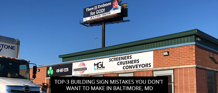
To help you steer clear of common and costly advertising errors, and get the most for your marketing spend, today’s post highlights 3 building sign mistakes spotted in Baltimore, MD.
Read on to learn what not to do when designing your building sign, or call (410)-877-6011 to speak directly with a building sign expert near you!
Templates are fantastic tools for building sign design, providing a solid starting point so your project hits the ground running. But be careful not to lean too much on common building sign templates, as you could end up mirroring the competition, making your brand almost indistinguishable from theirs.
According to research published in Frontiers in Psychology, novel building sign designs are necessary to “break through the advertising clutter in a competitive media marketplace” (Zhou et al., 2018, p. 471). In other words, if you want to stand out from Baltimore’s competition signscape, you need to be different, even unique, and that’s just not possible if you’re designing by numbers with a template.
At Baltimore Signs and Graphics, you can enjoy the best of both worlds. Not only do we offer a large selection of proven design templates, but our in-house graphics team will help you build off this foundation to create bespoke building signs that are uniquely your own. Of course, we can also help you break the mold, forgoing templates to create something one-of-a-kind, entirely from scratch, but many of our clients appreciate the headstart that design templates can offer, especially when their budget or timeline is tight.
Whatever you prefer, we’re standing by to help!
Lighting up your building signs is a great way to draw the eye, especially if your business operates after dark, but illumination errors can be costly.
Some common lighted building sign errors include:
Our illuminated building signs always look great, and never violate Baltimore’s sign code!
To browse our selection of energy-efficient illuminated building signs, check out our Outdoor Sign Gallery, or call (410)-877-6011 to speak directly with a member of our team.
Not only will your building sign need to stand out from those used by your neighboring competitors; it will also need to stand out from the surrounding environment.
So, for example, you want to avoid placing white signage on a white storefront—unless you want the substrate to blend into the facade, and the letters and graphics are designed to pop off.
Failing to consider the building sign’s display context could make it difficult for customers to find your business, effectively “camouflaging” your sign, and costing you thousands of impressions every week.
To learn more of the dos and don’ts of building sign design, and get a free quote on your next project in Baltimore, MD, you can:
Kara McCarthy
Jan, 2026
Nicole Parker
Nov, 2025
Daniel Grant
Oct, 2025
Nyasha Miller
Sep, 2025
WasteStrategiesPPC
Sep, 2025
Daniel Khoshkharaman
Sep, 2025
Kathy Cooper
Feb, 2025
Carrie McCubbin
Jun, 2025
Dana Jones
Jun, 2025
Stacey Schiano
May, 2025
STACEY GEIMAN
May, 2025
Krystal Lawton
May, 2025
John Ceselsky
May, 2025
Tim Thompson
Aug, 2024
Stephen O Dare
Dec, 2024
RealCarGirlsMatterTV DatPankCherokee
Dec, 2024
Richard Matuszak
Nov, 2024
Sean Lewis
Oct, 2024
Harry Caughey
Sep, 2024
Zakira W
Sep, 2024
Lizzie Bellinger
Aug, 2024
Larry Wills
Aug, 2024
Noam Efron
Jul, 2024
Scott Simmons
Jul, 2024
Gary Campbell
Jul, 2024
bdunks
Jun, 2024
Kim Huntley
May, 2024
Brian Leonardi
May, 2024
Garry Gill
Apr, 2024
Lorraine Sann
Apr, 2024
Hilary Fosler
Mar, 2024
Ben Supik
Dec, 2023
Rich Young
Jan, 2024
samuel keitu
Dec, 2023
Ron Sand
Nov, 2023
Megan Gadsby
Oct, 2023
Dr. Adam Summers
Oct, 2023
Monica Rowlands
Oct, 2023
Maura Dwyer
Oct, 2023
Alexia Jones
Sep, 2023
Roxanne VanPelt
Oct, 2022
George Stone
Jul, 2023
john Weiman-CPLC
Jul, 2023
Ashley Owings
Jul, 2023