
Oct 26,2021

Today’s post reviews some basics principles of graphic design theory to help you build better signs for your business in Baltimore, MD. Read on or call (410)-877-6011 to speak directly with a graphic design specialist in Baltimore.
Just as you prefer the text you’re reading now to be organized into neat columns, with consistent line spacing and sentences aligned to the left, so too your audience responds best to signs that follow their own internal rules (e.g. all elements center-aligned).
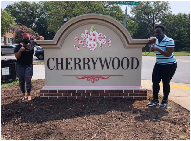
For example, you can just imagine how strange this monument sign design might look if the floral graphic element was left-aligned, while the CHERRYWOOD logo stayed in the center.
If something seems off with your graphic design, start by checking the alignment!
2. Create a clear visual hierarchy. When you have multiple visual elements working together in a design, it’s critical that you create a clear visual hierarchy. In other words, you must be sure to give extra weight to your most important message, whether that’s your brand name or the details of a limited time offer. The primary message will depend on your sign type and marketing goals (e.g. main building signage will make the brand name most prominent, while indoor branded wayfinding signs will emphasize the directions being given), but this rule always stands.

This branded informational sign for Amazon creates a clear visual hierarchy, emphasizing its large, central message over the Amazon brand name.
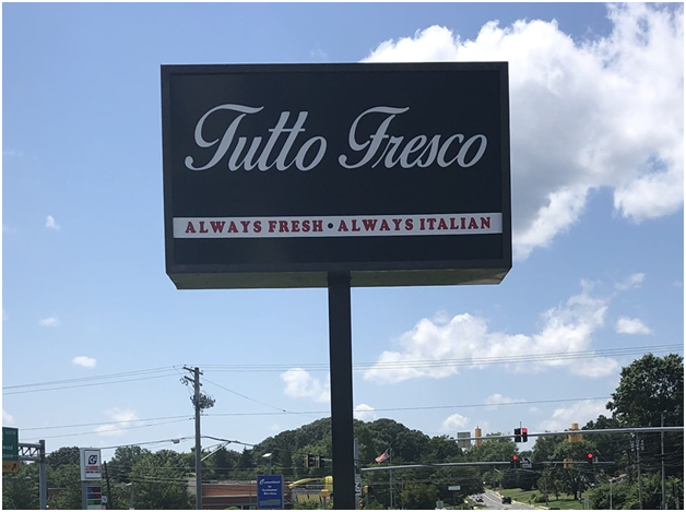
This graphic design exemplifies the principles of contrast, using white text on black, red text on white, and even creating contrast between the typography.
Baltimore Signs and Graphics is a leading provider of graphic design and sign manufacturing services throughout Baltimore and all the surrounding communities, including:
To book a free consultation with our graphic design specialists, you can:
Lorraine Sann
Apr, 2024
Christina Printy
Apr, 2024
Hilary Fosler
Mar, 2024
Ben Supik
Dec, 2023
Rich Young
Jan, 2024
samuel keitu
Dec, 2023
Ron Sand
Nov, 2023
Megan Gadsby
Oct, 2023
Dr. Adam Summers
Oct, 2023
Monica Rowlands
Oct, 2023
Maura Dwyer
Oct, 2023
Alexia Jones
Sep, 2023
Roxanne VanPelt
Oct, 2022
George Stone
Jul, 2023
john Weiman-CPLC
Jul, 2023
Kelland Bailey
Jun, 2023
Nardine Assaad
May, 2023
Bishop Joseph Bowens
Apr, 2023
Arnaud Timamo
Mar, 2023
Community Housing
Feb, 2023
Travis Baird
Feb, 2023
LN Rv4fun
Dec, 2022
Tanya Johnson
Dec, 2022
Erick Satchell II
Nov, 2022
Jennifer Gamble
Nov, 2022
themetri
Sep, 2022
Ben Colbert
Sep, 2022
Napoleon Portillo
Aug, 2022
Tobias Greiff
Jul, 2022
Alex Garcia
Jul, 2022
Italo Liberatore
Jun, 2022
Bradford Webster
Jun, 2022
Thelma Paine
May, 2022
Gregory Ham
Apr, 2022
Joyce Brown
Apr, 2022
Damion DeSantis
Apr, 2022
Norma Rosario
Mar, 2022
Vince Piscopo
Mar, 2022
Dre
Mar, 2022
Kris Konstruction
Jan, 2022
Ryan Duff
Nov, 2021
Gina Brown
Oct, 2021
Sherrie Snowden
Oct, 2021
Garrick Good
Oct, 2021
Keith Tobin
Oct, 2021
Sam Palm (Palmtree)
Sep, 2021