
Oct 02,2023

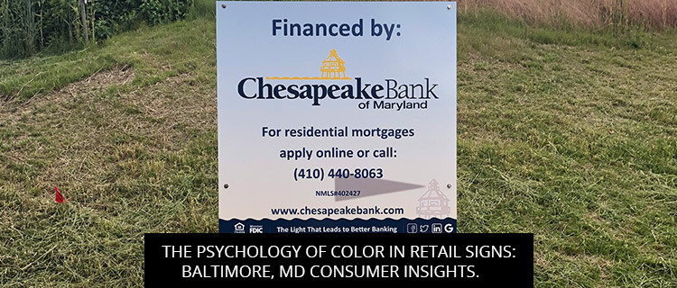
When walking down the streets of Baltimore, MD, what makes you stop and look at a retail sign? Is it the design, the brand name, or perhaps the color? Color psychology plays a pivotal role in influencing consumer behavior. It’s not just about aesthetics; colors can evoke emotions, convey messages, and even influence purchasing decisions.
The impact of color on human behavior and decision-making is profound. It’s no coincidence that top brands invest significantly in choosing the right colors for their logos, advertisements, and, by extension, their retail signs.
In a city as vibrant and eclectic as Baltimore, the competition among retailers is high. It becomes imperative for stores to use every tool at their disposal, and understanding color psychology is one such potent tool.
Different cultures and regions often have varying interpretations and emotional responses to colors. Here’s a quick look at how Baltimore consumers might react to specific colors:
At Baltimore Signs and Graphics, we understand the nuanced art of blending color psychology with design elements. Our team is adept at analyzing the locale, understanding the target audience, and creating retail signs that resonate with the Baltimore consumers’ psyche.
Color psychology isn’t about rigid rules but understanding the subtle nudges that colors can give to consumers’ minds. In the dynamic retail landscape of Baltimore, MD, where every sign is vying for attention, the right color choice can be the difference between blending in and standing out.
If you’re looking to design retail sign that connects, conveys, and converts, Baltimore Signs and Graphics is here to guide you. With a deep understanding of local sensibilities and global design trends, we create signs that truly resonate. Contact us today and let’s paint the town with signs that matter!
Harry Caughey
Sep, 2024
Zakira W
Sep, 2024
Lizzie Bellinger
Aug, 2024
Tim Thompson
Aug, 2024
Larry Wills
Aug, 2024
Noam Efron
Jul, 2024
Scott Simmons
Jul, 2024
Gary Campbell
Jul, 2024
bdunks
Jun, 2024
Kim Huntley
May, 2024
Brian Leonardi
May, 2024
Jack Woloszyn
Apr, 2024
Garry Gill
Apr, 2024
Lorraine Sann
Apr, 2024
Hilary Fosler
Mar, 2024
Ben Supik
Dec, 2023
Rich Young
Jan, 2024
samuel keitu
Dec, 2023
Ron Sand
Nov, 2023
Megan Gadsby
Oct, 2023
Dr. Adam Summers
Oct, 2023
Monica Rowlands
Oct, 2023
Maura Dwyer
Oct, 2023
Alexia Jones
Sep, 2023
Roxanne VanPelt
Oct, 2022
George Stone
Jul, 2023
john Weiman-CPLC
Jul, 2023
Ashley Owings
Jul, 2023
Kelland Bailey
Jun, 2023
Nardine Assaad
May, 2023
Bishop Joseph Bowens
Apr, 2023
Arnaud Timamo
Mar, 2023
Community Housing
Feb, 2023
Travis Baird
Feb, 2023
LN Rv4fun
Dec, 2022
Tanya Johnson
Dec, 2022
Erick Satchell II
Nov, 2022
Jennifer Gamble
Nov, 2022
themetri
Sep, 2022
Ben Colbert
Sep, 2022
Napoleon Portillo
Aug, 2022
Tobias Greiff
Jul, 2022
Alex Garcia
Jul, 2022
Italo Liberatore
Jun, 2022
Bradford Webster
Jun, 2022
Thelma Paine
May, 2022
Gregory Ham
Apr, 2022
Joyce Brown
Apr, 2022