
Jan 13,2023

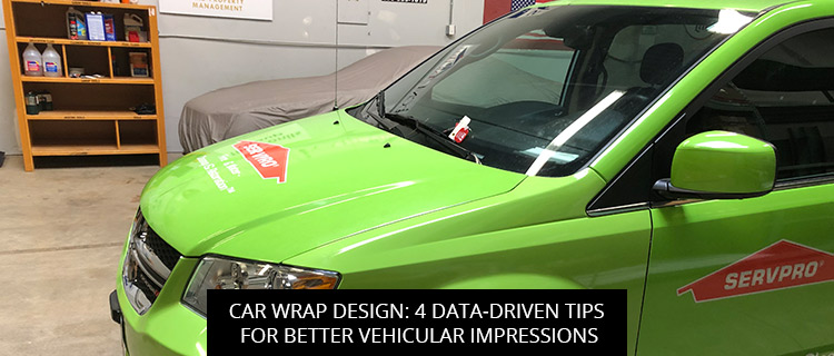
To help you create standout mobile marketing materials, today’s post reviews 4 data-driven best practices for car wrap design.
Read on to learn more, or call (410)-877-6011 to speak directly with a representative from our car wrap department in Baltimore, MD.
According to marketing research, the average viewer only looks at outdoor signage for 1.5 to 4.6 seconds. And when your audience is behind the wheel of a moving vehicle, viewing times get even shorter.
Knowing this, it is critical that you design your car wrap copy for easy consumption. As discussed in research by the Interdisciplinary Journal of Signage and Wayfinding, we want to minimize the perceived “cognitive burden” required to read your copy, which means:
If you need help branding with brevity, get in touch with our car wrap design team. We’ve helped dozens of local businesses create lean, inviting, and effective marketing copy, and we can do the same for you.
The International Sign Association (ISA) recommends making your sign messages at least 1” tall for every 10’ of distance between your reader and your audience. However, because car wraps are often viewed in motion, we recommend going even bigger.
Of course, you will need to identify your primary audience before you can make a meaningful decision about letter size. Are you looking to engage drivers in the lane next to you, or are you looking to create a billboard on wheels that can be read from across a busy intersection?
Whatever your marketing goals may be, our car wrap designers can help you find the right fit.
Nowadays, audiences are routinely exposed to multimodal messages, as websites, television commercials, and high-performing ads are increasingly using a mix of pictures and text to convey their meaning more effectively.
Using pictures and graphics in your ads not only makes your car wrap designs easier to recognize and process than text-only ads; it also makes them easier to recall.
“When words enter long-term memory they do so with a single code,” writes P. Dewan in a report for the Journal of Library and Information Practice and Research (2015). “Pictures, on the other hand, contain two codes: one visual and the other verbal, each stored in different places in the brain.”
By giving readers two independent ways to access visual memories, known as dual-coding, you make your car wrap message easier to recall. And by combining images and text, you give audiences three routes to recall, making your ads even more memorable.
Whether you have a brand logo in-hand or you need help creating high-impact imagery from scratch, our car wrap designers are standing by to simplify your multimodal marketing.
Even killer marketing messages fall flat when presented in the wrong font or letter case.
For example, according to one study by the Transportation Research Record, signs written using all-uppercase letters are more than twice as difficult for drivers to read, and the same applies to your car wrap designs (Garvey et al., 1997).
Similarly, messages written in outline fonts (i.e. fonts that are not “colored in”) must be 1.8 times larger than solid fonts to achieve equivalent legibility.
Marketing researchers have also noted that serif fonts typically outperform sans serif fonts in visual acuity measures, and more fanciful, high-complexity fonts struggle across the board (Aditi et al., 1997; Arditi, 2005).
To explore your different options and get a shortlist of high-performance fonts from our specialists, get in touch with our car design department.
To learn more about effective car wrap design and get a free quote on any order in Baltimore, MD, you can:
References
Arditi, A., & Cho, J. (2005). Serifs and font legibility. Vision research, 45(23), 2926-2933.
Arditi, A., Liu, L., & Lynn, W. (1997). Legibility of outline and solid fonts with wide and narrow spacing. Trends in optics and photonics, series, 11, 52-56.
Dewan, P. (2015). Words versus pictures: Leveraging the research on visual communication. Partnership: The Canadian Journal of Library and Information Practice and Research, 10(1).
Garvey, P. M., Pietrucha, M. T., & Meeker, D. (1997). Effects of font and capitalization on
legibility of guide signs. Transportation Research Record, 1605(1), 73-79.
McNeish, J. E. (2020). Retail signage during the COVID-19 pandemic. Interdisciplinary Journal of Signage and Wayfinding, 4(2), 67-89.
Lizzie Bellinger
Aug, 2024
Tim Thompson
Aug, 2024
Larry Wills
Aug, 2024
Noam Efron
Jul, 2024
Scott Simmons
Jul, 2024
Gary Campbell
Jul, 2024
bdunks
Jun, 2024
Kim Huntley
May, 2024
Brian Leonardi
May, 2024
Jack Woloszyn
Apr, 2024
Garry Gill
Apr, 2024
Lorraine Sann
Apr, 2024
Hilary Fosler
Mar, 2024
Ben Supik
Dec, 2023
Rich Young
Jan, 2024
samuel keitu
Dec, 2023
Ron Sand
Nov, 2023
Megan Gadsby
Oct, 2023
Dr. Adam Summers
Oct, 2023
Monica Rowlands
Oct, 2023
Maura Dwyer
Oct, 2023
Alexia Jones
Sep, 2023
Roxanne VanPelt
Oct, 2022
George Stone
Jul, 2023
john Weiman-CPLC
Jul, 2023
Ashley Owings
Jul, 2023
Kelland Bailey
Jun, 2023
Nardine Assaad
May, 2023
Bishop Joseph Bowens
Apr, 2023
Arnaud Timamo
Mar, 2023
Community Housing
Feb, 2023
Travis Baird
Feb, 2023
LN Rv4fun
Dec, 2022
Tanya Johnson
Dec, 2022
Erick Satchell II
Nov, 2022
Jennifer Gamble
Nov, 2022
themetri
Sep, 2022
Ben Colbert
Sep, 2022
Napoleon Portillo
Aug, 2022
Tobias Greiff
Jul, 2022
Alex Garcia
Jul, 2022
Italo Liberatore
Jun, 2022
Bradford Webster
Jun, 2022
Thelma Paine
May, 2022
Gregory Ham
Apr, 2022
Joyce Brown
Apr, 2022
Damion DeSantis
Apr, 2022
Norma Rosario
Mar, 2022