
Mar 23,2020
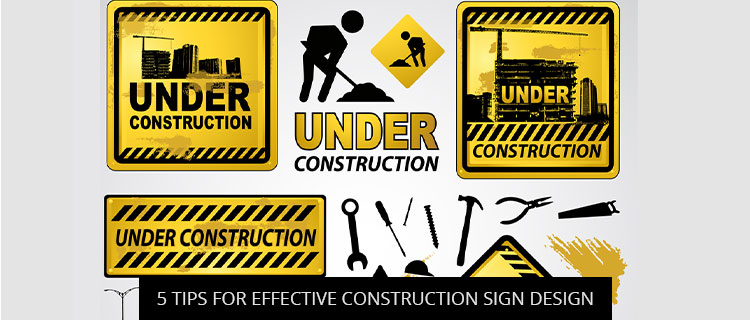
Today’s post shares 5 tips for better construction sign design. Read on to learn how Baltimore construction businesses are keeping workers and members of the public safer with branded signage.
Construction signs play a very important role in Baltimore development. Construction workers rely on them to give notice when special protective equipment is needed; contractors and site managers depend on construction signs to keep their sites safe and liability-free; and members of the general public look for construction signs to stay en route, informed, and out of danger (or out of unauthorized areas).
Notice that none of these primary functions centered on wowing the viewer with some impression image, fancy font, or avant-garde art piece. That’s because construction signs are all about function over form. And while that doesn’t mean you always need to stick with the cookie-cutter templates, function always comes first. Accordingly, the top priorities of all construction sign design should be legibility and visibility. If your custom design detracts from either, even the tiniest bit, it’s a big problem.
Building on the previous point about the importance of legibility and visibility, it’s usually a good idea to choose brightly colored construction signs to maximize visibility. Brighter colors tend to get spotted easier, especially at night, where construction site hazards are particularly dangerous. Baltimore Signs and Graphics offers complete construction sign design customization, so you can choose any color you want, and potentially even discover some bright and highly visible options that suit your brand’s palette.
Unfortunately, picking bright colors doesn’t guarantee that your construction signs get read. For instance, lime green lettering on a fire-red background might get your sign spotted, but the color contrast is so bad that your message is basically illegible.
Baltimore Signs and Graphics recommends the following classic contrast combos to start with:
But don’t worry–these combinations are just the tip of the iceberg. Your dedicated project manager will explain all the options available to you during your free construction sign design consultation.
The most effective construction signs combine basic images with short-and-simple sign copy to get their point across at a glance. As a general rule, dense blocks of text get read less often than their leaner counterparts, and “image-only” construction signs leave too much open for interpretation. For best results, take a cue from the wayfinding world and combine the two.
Function beats form, but that doesn’t mean you need to throw “form” out altogether. By designing your construction sign with your brand colors, fonts, or imagery, you can show visitors and workers that your brand is keeping them safe. Speak with our design experts for some ideas on how to incorporate branding without detracting from the primary sign function.
Call 410-877-6011 or fill out the contact form on our website to speak with a construction sign design expert to get a 100% free quote.
Jessica Fritz
Jun, 2026
Emily Annunziata
Jun, 2026
Stacey Schiano
May, 2025
chris duff
Mar, 2026
Kara McCarthy
Jan, 2026
Nicole Parker
Nov, 2025
Daniel Grant
Oct, 2025
Nyasha Miller
Sep, 2025
WasteStrategiesPPC
Sep, 2025
Daniel Khoshkharaman
Sep, 2025
Kathy Cooper
Feb, 2025
Carrie McCubbin
Jun, 2025
Dana Jones
Jun, 2025
STACEY GEIMAN
May, 2025
Marvin Smith
May, 2025
John Ceselsky
May, 2025
Tim Thompson
Aug, 2024
Stephen O Dare
Dec, 2024
RealCarGirlsMatterTV DatPankCherokee
Dec, 2024
Richard Matuszak
Nov, 2024
Sean Lewis
Oct, 2024
Harry Caughey
Sep, 2024
Zakira W
Sep, 2024
Lizzie Bellinger
Aug, 2024
Larry Wills
Aug, 2024
Noam Efron
Jul, 2024
Scott Simmons
Jul, 2024
Gary Campbell
Jul, 2024
bdunks
Jun, 2024
Kim Huntley
May, 2024
Brian Leonardi
May, 2024
Jack W. Calvert
Apr, 2024
Garry Gill
Apr, 2024
Lorraine Sann
Apr, 2024
Hilary Fosler
Mar, 2024
Ben Supik
Dec, 2023
Rich Young
Jan, 2024
samuel keitu
Dec, 2023
Ron Sand
Nov, 2023
Megan Gadsby
Oct, 2023
Dr. Adam Summers
Oct, 2023
Monica Rowlands
Oct, 2023
Maura Dwyer
Oct, 2023
Alexia Jones
Sep, 2023